
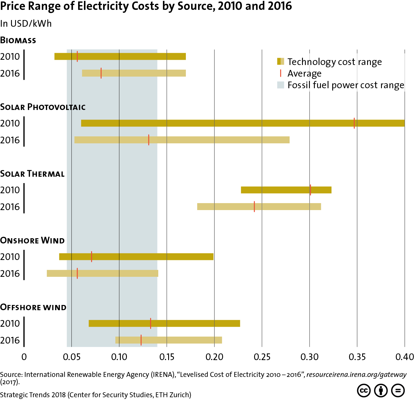


This graphic contrasts the price range of electricity costs stemming from renewable sources with that of fossil fuels for the years 2010 and 2016. For more on the interplay between technological innovation and the geopolitics of energy, see Severin Fischer’s chapter for Strategic Trends 2018 here. For more CSS charts, maps and graphics on economics, click here.
One reply on “Price Range of Electricity Costs by Source, 2010 and 2016”
The price did increase due to the fact that demand is always higher. Every year each country multiplies the population. Thus increasing the demand for it.