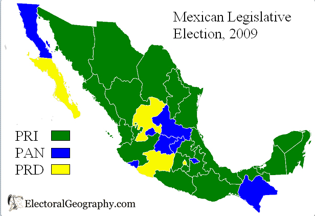
Ever since my first hiking holiday, I’ve been a big fan of maps! So I was thrilled to discover the website Electoral Geography 2.0. It gathers election and voting data from all over the world and illustrates most of it with maps.
For example, check out the results of last weekend’s elections in Bulgaria or Mexico. International media usually reports on overall national results. But I like comparing regional patterns, since these are often very telling about ethnic and social cleavages. Electoral Geography 2.0 also provides election results from previous years, which also make for interesting comparisons.
According to the authors of the website, electoral geography is the study of regularities and patterns of election results. They don’t provide original analysis (yet?), but they do have a page listing a few good papers and articles on the topic.

